Lessons Learned in Direct Publication: End Matter

We’ve been discussing formatting a manuscript for direct publication to print. I’ve spent time going over Front Matter, Formatting the Body of the text, Scene Breaks, Headers/Footers, and the value of Advanced Reader’s Copy. Today we discuss End Matter.

I did a review of books out there for sale in stores and with book vendors. There were some things in common with those books. The end of the book contained several components referred to as End Matter.

There were usually a couple of pages dedicated to a preview of books the author will have out for sale, their to be released information. This is often followed by a page that expands a bit on other books the author has for sale. Usually a title and a short blurb. Sometimes art work from the cover. I used both of these in my forthcoming manuscript.

Then often there will be a short excerpt from that forthcoming to be released title. I didn’t do that because I wasn’t ready to release that excerpt. It may be a marketing opportunity missed.

There is a great video that I gleaned some of this information from. I learned a few tricks beyond what the video had to offer but it is still a great listen to pick up the specific how too’s for some of the things I’ve discussed in these articles.

Next I will be talking about how all this print format stuff relates to the Kindle e-book publication.

Lessons Learned in Direct Publication: The Advanced Reader’s Copy

I’m putting myself out here pretty vulnerable today. I’ve been working very hard on my first direct publication release. I can’t tell you the countless hours I have spent editing, (my partner has spent, my critique partner has spent, … get the idea.  Lots of people…lots of read through time, out loud and on the screen.)

Now I want to preface this by saying that this Direct Publication project is actually my eighth release. The previous titles were handled through a publisher. So, I’m not the new kid on the block but still in my toddler-hood of publishing.

I couldn’t resist taking a peek and reading some of the finally published book last night. Imagine my horrrrrrification when I found an error, and another, and another. Little things perhaps, huge in my mind. My baby has a flaw. It’s not perfect, it’s freakin messed UP!~

Oh what it done is done. What can I do now. Learn from it is the best advice I can give myself.

First off I am going to fix the errors.

Next, learn that no matter how many times I’ve edited…me and my crew…there are going to be mistakes. Accept that as part of life. The Navaho create beautiful art and leave one tiny flaw on purpose so as to not mock the Gods…human’s aren’t perfect.

Second, never under estimate the value of advanced reader copy.

Perhaps I would have found those errors by printing the whole smole from the Create Space final proof.  Certainly if I had allowed time in my process to order one printed copy of the book to read one FINAL time myself, I would have found the errors.

Some how the words do look different in print compared to the computer screen.

If I had budgeted my time, planned better then those typo errors would have been found. Maybe? most of them? perhaps. But I let myself get pinched on the end. I took two weeks off when my daughter had a horrible motorcycle accident. That wasn’t in my time budget and it caused me to crimp things on the end.

I didn’t take the time….have the time…make the time… to order that final advanced readers copy. Now, I’m sad.

I’ve exposed myself here and made myself very transparent. I think it’s important to talk about those hard things.

So, learn form my mistake. I hope I do.

See my other articles on this wonderful creative process of direct publication:

Front Matter; Body; Scene Breaks; Headers/Footers; End Matter; Formatting for Kindle

A Baby is Born…Baby Book that is~!

So, on with the continuation of my story from last night.

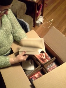
I trip over this box on my front porch. Dragging in late from a perfect day of biking, massage and grocery shopping.  My baby had arrived. Since a picture is worth a thousand words. Go for it!

1970-02-12 15.11.02No Wait a minute. That’s my grandson from a couple years ago. (looking) Ah here it is.

2014-04-18 23.04.07The Postal Stork came through for me.

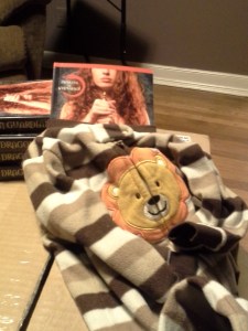
A full cover reveal is promised to Indy Book Fairy and Smart Girls Sci Fi. So you can’t see the baby “NAKED” until later.

2014-04-18 20.45.40Here are your teasers!

2014-04-18 21.25.14Be sure to drop by my Facebook page and check out my local Book Release Parties in May.

2014-04-18 20.51.16It is in fact a perfect day.

Lessons Learned in Direct Publication – Headers/Footers

I’ve been discussing all the things I’ve learned in the course of formatting my manuscript for direct publication in print. I’ve discussed Front Matter; The Body of the Manuscript; How to handle Scene Breaks.  The value of Advanced Readers Copy shouldn’t be overlooked.

I was slightly familiar with Headers and Footers but I didn’t know quite how that might apply to my manuscript.

What I did notice in my review of books out there for sale pertaining to headers and footers might seem confusing. Lets start with page numbers. The page numbers can be at the top of the page or at the bottom they can be centered or on the outside corner of the page. They are not usually on the inside corner of the pages. Wherever they are they are contained in the headers at the top or footers at the bottom.

I placed mine in the center of the bottom of the page…In the footer. I found a cool symbol that tied in with the theme of my manuscript to use around the page number. It was part of the footer set up application.

That left my Header tool (top of the page) to use for other purposes. I programmed it to print my manuscript title on the even pages and my author name on the odd pages. The lettering font was different from the manuscript text but the same choice as the page numbers at the bottom. Nice crisp and clear in capital letters. I chose the Calibri 10pt font for this purpose.

Its able to be programmed for different information on the even pages vs the odd pages. That’s how I could do the title on one and the name on the other.

I will be talking about End Matter next and then more about formatting for Kindle.

Glimmers of Perfection

Today started out like any other, near perfection in paradise.  The lady librarian teased me while we were driving about my dragon worlds. I told her she was full of sass and vinegar.

2014-04-18 12.33.59We drove down to the Cherokee Reservation and went biking on the trail along the river.2014-04-18 12.34.11

We saw all the beautiful spring flowers in bloom. Purple and white violets, trilliums, Flowers I don’t even know the name of. We biked about 5 miles in a spring fairy land.

Then since last week was our one year anniversary, I’d gotten her a couples massage gift certificate. So we went from biking up to Asheville for our massage appointment. One word, heavenly. That was followed by Japanese dinner.

We did have to take care of a matter of shopping for a shirt for the lady since we have a wedding to attend tomorrow and act as greeters for the festivities. And we had grocery shopping. A near perfect day.

We arrived home, unloaded bikes, groceries, shopping bounty. I worked my way up the stairs from the front after parking the truck and found a very large box on our porch.  Tomorrow I’ll tell you what was in the box.  But for today. It is a perfect day in paradise!

EDEN GLENN Goes Live on Amazon UK

For all my readers in the United Kingdom. EDEN GLENN has an Amazon Author’s Profile in the UK now. Check it out.

http://www.amazon.co.uk/Eden-Glenn/e/B008M01IMY/ref=sr_ntt_srch_lnk_1?qid=1397677476&sr=8-1


New Technology

New Technology abounds. A friend recently reminded me that there was a time when wise men and women could know everything there was to know. Everything possible to be known at that time and place could in fact be learned and known by a single person.

That isn’t possible any longer. Technology and the world is changing by the second. The best we can hope for is to know all the ways to retrieve information when we need it.

Comments?

An interesting side note. I posted this blog post by writing an email. Very interesting tool here.

Lessons Learned in Direct Publication: Scene Breaks

I’ve been talking about how to handle formatting a manuscript for direct publication for print. We’ve discussed Front Matter; The Body of the Manuscript. Today I’m discussing Scene Breaks.

In reviewing books out there for sale I noticed something very interesting about how publishers formatted the breaks between scenes. When the scene’s change at the bottom or very top of a page there is a symbol inserted to indicate the change of scene. Because when that change occurs at the ending of a page or the beginning of the next it’s important to warn the reader of that transition. It doesn’t matter if the symbol is at the bottom of the page or at the top.  Often four **** formatted in BOLD are sufficient. I found a symbol that ties into the theme of my story. The symbol was followed by an extra empty line.

However, when the scene changed in the middle of a page there was a different treatment. The change was preceded by an empty line. Then the first few words of the first sentence of the new scene was formatted through the font drop down function where you check “small capital”.  Then those words selected would change to small capital letters.

Naturally any formatting of this nature with scene breaks etc has to be the last touch of formatting. If anything else changes after this it might change where the scene break is positioned thereby changing whether you need a symbol to mark the break or just the change to small capital font.

More later on Headers/Footers and End Matter also the value of Advanced Reader’s Copy as well as formatting for Kindle.

Lessons Learned In Direct Publication: The Body

Last time I discussed how to handle Front Matter in formatting your manuscript for Direct publication to print. Continuing on with that theme. The body of the manuscript. I learned a whole lot about MS-Word in the process of this project. One of the most interesting things was about “Style”. Setting up the “Style” tabs for various parts of your manuscript builds the table of contents automatically. It also allows you to make global changes with a couple of clicks. The third advantage is being able to move around the manuscript from the headings bar on the left with one click. IT is a beautiful thing!!

I set up one “Style” Tab for my chapter headings. It allows me to program how many spaces down the page it will appear. How many lines between the heading and the body of the text. I can set the size and choice of font as well as placement. I set up another style for the body of the manuscript text. I was also able to program at what level I wanted the various “styles” to set out at.

The next thing I noticed from my earlier review of books in print was the way the manuscript was handled within the body of text. At the beginning of each chapter there were several words emphasized in a different font.  I liked the look of the Copperplate Gothic light.

More later about how to handle scene breaks, the headers/footers for formatting a manuscript and the end matter, the value of Advanced Readers Copy and getting everything ready for Kindle.

Lessons Learned in Direct Publication – Front Matter

In a review of currently published books I learned a couple of things to apply to my own direct publication project.

I looked at quite a few copies of books for sale at my local book store. So for the purpose of this article we will be talking about books in print and the summation of what I saw when thinking about style and formatting.

First off the results of my review of front matter at the beginning of the book. Many of the books would lead off with  a pre-title page with the series name and the particular volume name on it as the right hand facing page. The back of that page would be a page listing other books by the author on the back of the page or left side page. Often that would contain the copyright and the ISBN numbers at the bottom.

The next page or two often had some words of praise for past work by the author, set up front and back or right facing and then turned…left facing.

Next came the main title page with author and often a publisher seal at the bottom. Those title pages are right facing. The back of that page now left or back side would contain all the disclaimers, notes, copyright penalty etc. along with a note of cover design credit and then the edition number.

The next right facing page is acknowledgements and comments of a sort. The back of that page left facing is left blank on purpose.

I had need of a glossary of words and terms with my book being a paranormal so I placed that next covering the right facing page and the back of it…left facing page.

This varied a little bit but next I put a Dedication page right facing and the back of it left blank on purpose.

This was the end of the front matter. The body of the manuscript started after this with Chapter one.

I will have future articles that discuss the things I learned about formatting the body of the manuscript; how to handle scene breaks; headers and footers; end matter, the value of Advanced Readers Copy and additionally how to format for Kindle.